|
Colour is one of the most important parts of a logo, as it can completely change the target audience and the ethos of the logo. 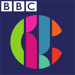 The new CBBC logo shows multiple different colours. The reason this is done is it is colorful. the target audience for CBBC is kids and multi coloured things are appealing to children. Also they have a range of colours so most kids have their favorite colour in the logo. It also appeals to both genders with pink and red for girls and blue and green for boys. 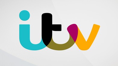 This is the ITV logo. This logo is multicolored also. The reason for this is to widen the target audience increasing the daily viewers. The different colours allow different age groups and genders to like the logo. It has pink and yellow for females and blue and green for males. It has light colours like yellow for children and dark colours like black for adults this widens the range more. 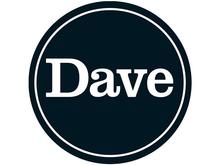 The dave logo has 2 colours only. White and black. This makes the logo seem more sophisticated and simple. This appeals to older people who want to be more sophisticated. It also appeals to younger audiences as they will watch the channel and feel older. 
0 Comments
|
AuthorWrite something about yourself. No need to be fancy, just an overview. ArchivesCategories |
 RSS Feed
