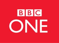
 Logo: BBC One Shape:The shape of the BBC one logo is plain and simple. This gives the impression that the channel is direct and simple. They give the facts, in the news. The logo also gives the impression of truth. Font: The font is simple once again this shows that they are direct in what they say in the news and get to it and don't waste time. The font of the One also links to the main BBC logo. Keeping the design, from the main logo. Colour: The colour is white. This colour gives the impression of being pure. This backs up the truth part of the shape and font. The red in the logo, gives the impression of power and responsibility, 2 things the BBC has or are associated with. Size: The size is usually quite small being in the corner of the screen. This is alright as the BBC 1 logo is so well known even when it is small people can recognise it. Information: The BBC one logo gives of small amount of information, being so plain. This links to the simplicity of the news they produce, being truthful and direct. The logo also links to the main BBC logo keeping the ethos and design the same. Target audience: The target audience is a very wide range. As they show a wide range of tv shows and types of show. Thorough the day the target audience changes thorough the day. Evening it is aimed at adults. Morning more at kids. and the day time for everyone. How the logo shows the target audience: The logo is simple giving the impression that it could be for older audiences. But the reason it is simple is to appeal to most audiences. BBC 1 shows general shows like the news and a range of tv shows. How it links to the channels identity: The BBC channel's identity is honesty, trust and cleanliness. This is supported by the logo  Logo: Quest Shape: The shape of the logo is a quest marker from games. The quest marker tells players where they need to go. It is also used in navigation on sat navs etc. The quest marker is known as somewhere you need to be going to or your destination. This could draw people in when they see the logo. Font: The font used is copied from the logo. The Q of Quest is the logo turned on its side slightly. The rest of the text is in the same style text. made from the Q. The font is bold but simple. Colour: The colour is Gold. This helps the impression that at the end of the quest there is gold. being a gold quest marker. The gold also represents the channel well. Being a gold mine of content. Size: The size can vary, from being small in the corner to large in the centre of the screen. Depending on the time it is used. IF used in an ident it will be in the centre of the screen with a clip of a tv show on one side, or will be in the bottom corner. Information: The logo does not give much for information about the channel. The logo is rather recent. Target audience: The target audience is men young to older adults. The types of shows aired are mechanical, making the channel appeal to mechanics, builders etc. How the logo shows the target audience: The quest marker will be known by young adults as a quest marker and the older adults will know it as a marker on a map. other age groups may not understand it. How it links to the channels identity: The channel aims to inform & entertain their viewers with slight comedy but mostly factual programs. 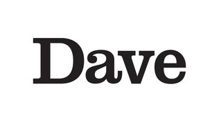 Logo: Dave Shape: The Dave logo is simple and is aimed at men. The name dave helps link as most people know a dave. It is meant to be like a friend. The shape is just the word dave in a simplistic font. Font: The font is very simple and in bold. The font is serif but not professional more in a comedy way. Colour: The colour once again is simplistic being just black text. Size: The size is quite large as it is usually show in the centre of the screen after an ident. Swell as in the ident. Information: The brand dave is simple and is aimed at men The brand is saying to be the mate dave you know The channel is funny and comical Target audience: The target audience is men. Younger to older adults. It shows comical shows that are aimed at men. How the logo shows the target audience: The logo shows the target audience by being simple. This is done bing just the test of the name dave. The target audience are appealed to the simplicity of the logo. How it links to the channels identity: The channels identity is comedy and banter. The ident represents this being the word dave. Dave the funny guy everyone knows.  Logo: Gold Shape: The shape is like a flag or a banner. It has a triangle cut out the end to make if more banner like. There is a flag pole on the left holding the banner up. Font: The font is a very simple bold word saying GOLD. This represents the simplicity of the channel .How it is just comedy shows playing. Simply just comedy. Colour The colour is gold like the channel name. The colour is a darker shade of gold on the left compared to the right, this adds more of an effect to the ident. Size: The logo is medium sized. Its bright colours draw the eyes to it so it does not need to be too big. The logo can be increased or decreased depending on the place it is being shown. Information: This channel shows comedy. The logo is meant to be entertaining to look at being bright coloured. The channel is also on Freeview tv, and is not a paid channel. Target audience: The target audience are older men. The types of shows shown are comedy shows that are older that were around when the older adults were kids. How the logo shows the target audience: The logo shows the audience by being slightly old fashioned with the banner. As banners used to be used a lot more in older times. How it links to the channels identity: The ident links to the identity of showing older shows by being old styles and have a old style like a banner. 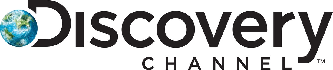 Logo: Discovery Channel
Shape: The ident is the words discovery channel. There is a globe onto of the D of Discovery. This represents the whole world, and that viewers can discover new things about the world watching this channel. Font: The font is a new font created for the channel. The font is rather simple once again. This is simple because they want to show they are simply a channel about discovering new things. Colour: The colour is black with a multi coloured globe. The colours draw you to the globe on the D. This makes the logo memorable. Size: The size of this logo is quite large. It is a long word Discovery, and it is in a large font. This draws your eyes to it being the biggest thing on the screen. Information: The channel shows documentaries and factual shows that are entertaining but mainly informative. The channel is for teaching about things around the world. Target audience: The target audience vary a lot. But is is mainly young adult men. The shows shows are documentaries and factual shows that entertain and inform the viewer How the logo shows the target audience: The logo shows the target audience by showing the globe. The globe gives the impression that it is informative, and that the people interested are interested in the world. How it links to the channels identity: The globe shows that the channel is about the world. Something the channel is about.
0 Comments
|
AuthorWrite something about yourself. No need to be fancy, just an overview. ArchivesCategories |
 RSS Feed
