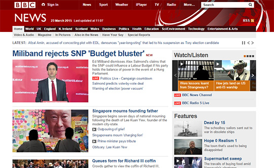
 The BBC website - The BBC's main website page shows links to Iplayer sport news and weather. The main page is a general news page, the website falls into the BBC's brand. The website suggests what people should watch or listen to, along with displaying recent big news stories. The website also follows the current ident theme, with red and white being the main colours used on the website. This helps people watching to recognise the channel at a different date. `This quest ident came out with lots of others. All of them linked to tv shows on the channel. they show people performing sports or mechanics and then turning on the tv and the quest logo appears. This links heavily with the shows on quest like all of their previous idents. This ident links to Treasure quest, a show that is about exploring, like the man in the ident. The ident also shows that you can ut on quest anywhere nomatther what you are doing, in a way they are saying there is no excuse not to watch. 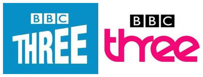 This shows BBC 3's old and new ident logo. The BBC logo on both are very similar just being different colours. The old ident looked old fashioned and the newer one looks more Morden. the newer one looks like neon tubes that are a more Morden invention. Also the pink colour of the new logo reflects the channels corporate identity better. 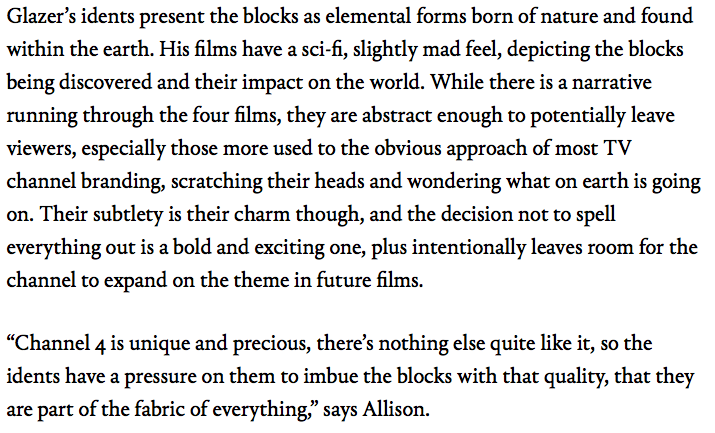 This is a blogger called Alison's review of channel 4. she has stated that channel 4 is unique and precious, And that idents need to be of high quality and they are of that quality. This review also states that channel 4's idents can be difficult to understand and it can leave viewers "Scratching their heads". This review is of the channel 4's repackaged idents and is an expert opinion. 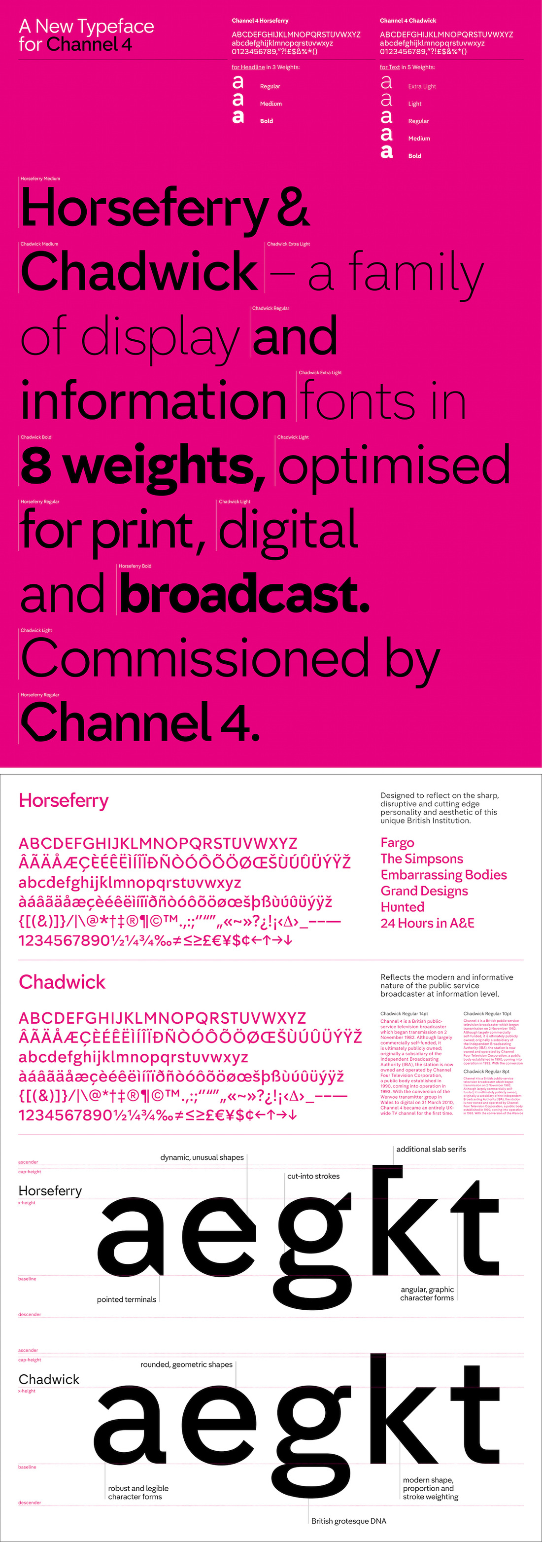 This is channel 4's new font typeface. This is part of their repackaged idents. This is the new typeface for the repackaged idents. The fact they have their own typeface shows they are professional and tells their viewers they can be bothered to spend the money and time on improving the channel for them. It is important for a channel to stand out with their typeface as all channels have one. Channel 4's typeface manages to stand out as it is not simmer to any other as they made it themselves. 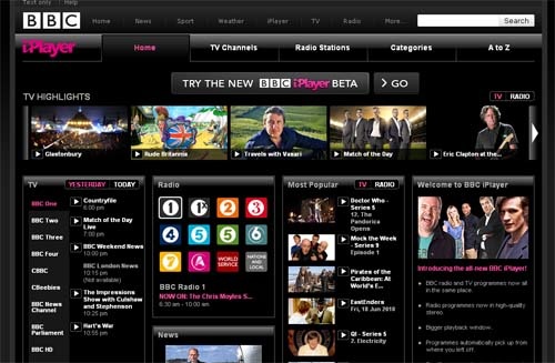 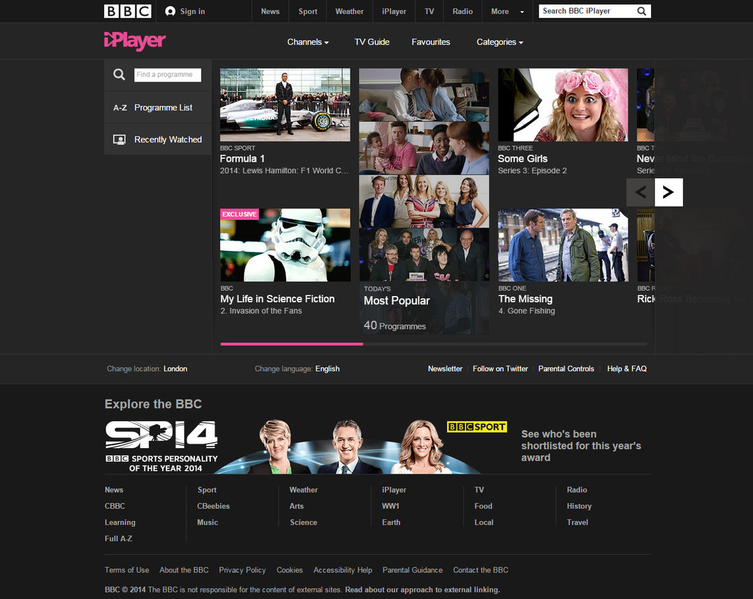 This is the BBC iplayer home page. The page shows popular tv shows on iplayer that people are watching at the moment. The page suggests shows that a user may want to watch from previous visits to the site. They also suggest shows that other people are watching at that moment. They also have links to radio weather and news pages of the main BBC website. The page also displays the BBC logo with the Iplayer logo alongside. This links this page to the main BBC website and the channel. There is also an advertisement for the BBC sports personality of the year. This is advertising another show that users should watch. The site has no adverts that are not hosted by the bbc as the bbc is not run by adverts but by the UK tv licence, that all British people pay.
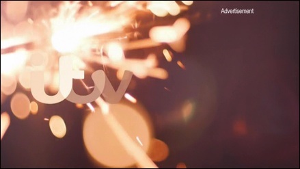
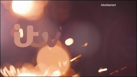
This is an example of a Itv ident. This is one of the new repackaged idents that they released. The ident shows the typical ITV logo with a sparkler in the background. The ident shows the itv logo, witch appears slowly over time, like all their other repackaged idents. This ident is very short and allows a announcer to announce what tv show will be coming on next and sometimes whats on after that.
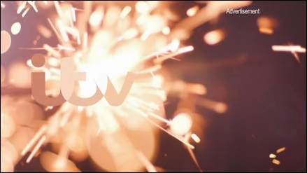
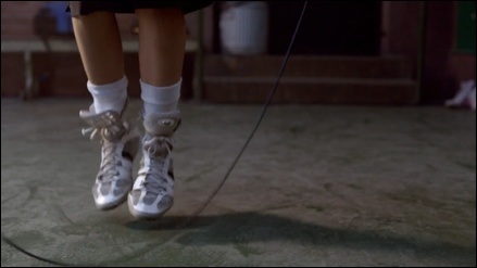
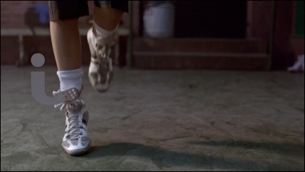
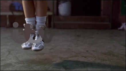
This is another one of ITV's new repackaged idents. This one is longer and allows the announcer to talk more about the upcoming shows and news. The logo is the same as the other idents and appears in the same way where it fades in in different colours and makes it stand out as time goes on.
0 Comments
|
AuthorWrite something about yourself. No need to be fancy, just an overview. ArchivesCategories |

 RSS Feed
