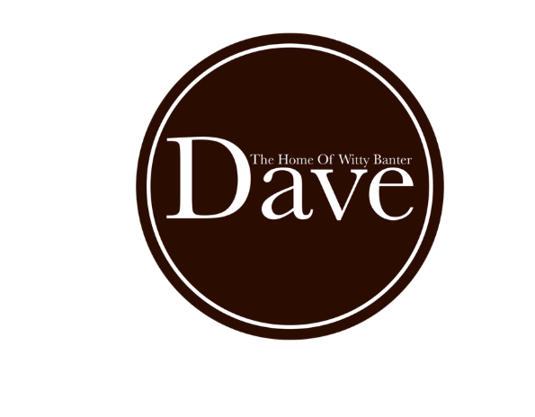
 This is my final logo design. I chose this design as I feel that it sticks more to the channel's identity than the other logos I designed adn because it feels the most refined and professional out of the bunch.
This logo uses Baskerville as its typeface. I chose this font as it is the closest font I could find to Dave's actual logo and looks very sophisticated, which ties in to the more serious side of the channel's brand. I changed the main colour of the logo from black to brown as I felt it connected more with the comedic side of the brand than the black; this is because of the connotations stemming from these colours. Black connotes formailty, elegance and sophistication whereas brown is a more rustic, homely colour which relates more to comedy than a serious colour like black. The logo is designed so that the font takes up most of the space within the circle, this even stretches so far as having the slogan above the smaller letters of the type so as to create a more uniform shape to fit inside the circle. This is a good logo because it delivers the message of everything that the channel is about while staying stylish, clean and professional in design.
0 Comments
|
AuthorWrite something about yourself. No need to be fancy, just an overview. ArchivesCategories |
 RSS Feed
