|
CITV new vs old logo  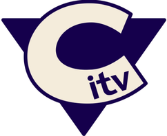 CITV changed their channel ident in 2006. This changed from the logo on the top to the one on the bottom. The old ident was in use from 1998-2006, it was definitely due a change as it lasted 8 years in daily use. The new logo was higher definition and fitted the channel more than the old one. "Our strategy was to create a powerful relationship and coherence between the ‘what’ of CBBC - its content - and the ‘why’ of its brand belief: the uniquely inspiring content of CBBC sparks the imagination of kids to make real life more awesome." Extract from Red Bee Creative Colour The new logo has less colour. The old logo consisted on Blue, Red and Yellow. When the newer logo has only Blue. The old logo was outdated and didn't fit the ITV brand. The colour in the new logo i feel fits the channel less well as it is more plain, the older one was more colourful and appealing to younger audiences, who the channel is aimed at. Shape The new logo has the main ITV channels logo inside the C, making CITV. This helps make the new logo more sophisticated, which once again fits the target audience less. The shape of the old logo seemed more childish, and maybe CITV were trying to increase their audience to older children, as the older logo looked like something a child could create in young years at school. Size The old logo was much larger than the newer one. The old one took up a large amount of space in the middle of the screen, when the newer logo can fit into a corner of a screen making space for other things during the ident break. Why they rebranded The reasons CITV rebranded is that the old logo had been in use for 8 years without change. So they decided to have a change and create a new logo. They modernised the logo as the old one looking at it now looks 90's fashion. Does it stick to the channel's corporate identity The new logo does fit the corporate identity by being silly and a bit funny. The channel's corporate identity is being funny and amusing the viewers, Being children and young teenagers. The new logo looks more sophisticated than the old one though. 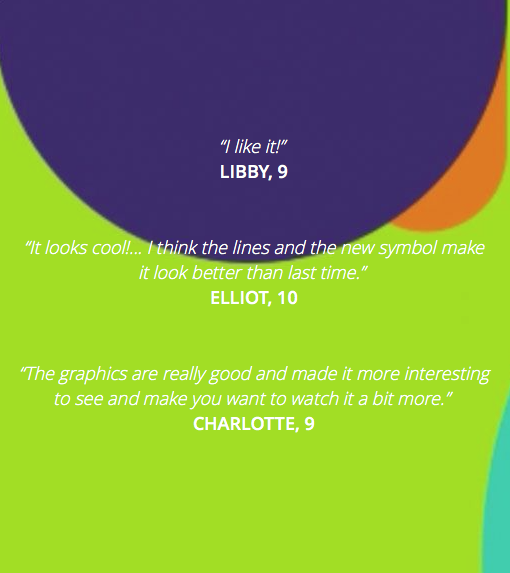 These are some reviews from some viewers of the channel.
0 Comments
|
AuthorWrite something about yourself. No need to be fancy, just an overview. ArchivesCategories |
 RSS Feed
